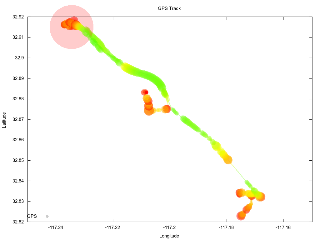
I’ve been playing around with ways to look at all the data I’m getting from the different systems on the Jetta. Here’s one I like. The radius of the circles is amps and the color represents speed. Bigger circles = more amps. Green = higher speed. The biggest red circle happens when the Soliton Jr starts up (the controller sends one sample that’s over 2000 amps, probably a glitch).
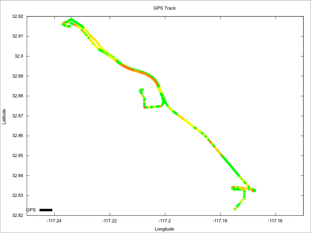
Here’s another way to look at the same data. Speed is not represented in this plot. Red = highest amps.
Here’s the data file for the above plots. The data file is produced by my logging software. The data comes from the Soliton Jr, the PakTrakr, and a NMEA GPS receiver.
The logging program is written in C and is pretty rough right now. I’m planning on releasing it under the GPL at some point.
This is the gnuplot script that generates the two plots shown above.
The gnuplot commands produce svg files. I use ImageMagick “convert” to convert the .svg files to .png. I like working with .svg files a lot, but they’re not quite common enough to post on the web yet.


